You are Missing Out on These Data Science Analysis on Hong Kong’s COVID-19 Situation
Why data visualization is so important amidst COVID-19.
30th July 2020
Utilizing data science and artificial intelligence (AI), we can take disease prevention and analysis to another level. For instance, Tencent announced a partnership with Zhong Nanshan, a high-level expert group of the National Health Commission to conduct AI-powered medical screening and to build a countrywide disease reporting and forecasting system.
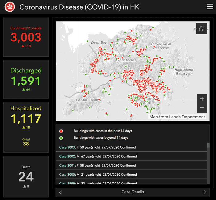
Yet, AI and data science is not just about machine learning. It’s also about data visualization. In comparison to SARS in 2003, the HK government launched its own COVID-19 dashboard to display the numbers and locations of COVID-19 cases in Hong Kong. In this time and age, visualizations are getting more and more important, because it allows the audience to truly understand trends and figures. For instance, the government’s dashboard allows users to actually see the places where infected cases happened to keep the public alert. It also marks places with cases in the past 14 days and beyond the 14 days quarantine period.
However, without accurate and up to date data plugged into the visualization, these visualizations would not matter. Hence, it’s extremely important that not only the visualization is easy to read and understand, but the data is automatically updated frequently.
As a HK resident, we’ve been lucky enough to keep the death rate lower than most regions. To be exact, we’ve only had 0.79% of death rate out of 2,885 COVID-19 cases (according to figures on 29 July 2020). This is a lot lower than what you see in the US and the world which have a death rate of 3–4%. This may be attributed to clear information flow and active precautionary measures took by citizens.
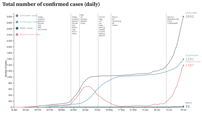
Locally, there are also automatic tracking visualizations created by universities and various organizations like ThinkCol (www.thinkcol.com ). ThinkCol puts together not only the numbers that people usually care the most — confirmed cases and the death cases, but also the number of discharged cases and cases subject to hospitalisation (Hospitalised Cases are defined as Confirmed — Discharged — Death) — which are numbers people should also take note on. By putting together these numbers, we see that despite there was a peak in number in April, the number of patients discharged almost catches up to the number of confirmed cases in May which means most people infected recovered. Considering that we have not officially found a cure for COVID-19, this is great news. However, this hypothesis has yet to be tested against Hong Kong’s third wave of COVID-19.
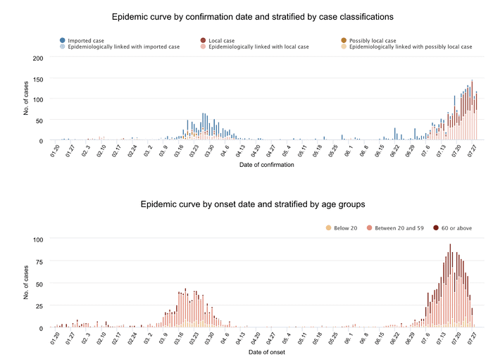
Another automatic tracking visualization is created by HKU Med. Not only are cases classified as locally infected cases and imported cases, the graphs also show the numbers for epidemiologically linked with local or imported cases as well as grouping by age. By dividing known data into categories and visualizing them, we are able to have a better grasp in how COVID-19 is affecting people and in what way.
Visualizations, along with AI and data science, are a great way to foster communication, especially if they are done right. Apart from these visualizations, what interesting COVID-19 visualizations should we be looking at?